Create a color scheme
Create a color scheme for a poster or room using swatches, mixing paints and testing combinations to learn basic color theory and contrast.


Step-by-step guide to create a color scheme for a poster or room
Color Wheel Art PROJECT - Step by Step TUTORIAL- Really EASY for kids or beginners #mrschuettesart
Step 1
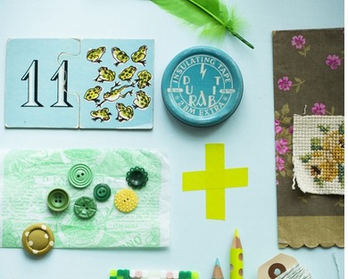
Gather all your materials and set them on a clean table so everything is easy to reach.
Step 2
Decide what mood or feeling you want your poster or room to have like calm energetic cozy or bold.
Step 3
Pick one base color from your paints that best matches the mood you chose.
Step 4
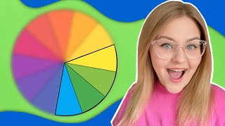
Draw a small color wheel on scrap paper using primary colors to help find matching and contrasting colors.
Step 5
Paint a swatch of your base color on white scrap paper so you can see it clearly.
Step 6
Mix a lighter tint of your base color on the palette by adding a little white.
Step 7
Paint a swatch of the lighter tint next to your base swatch for comparison.
Step 8
Mix a darker shade of your base color on the palette by adding a tiny bit of black or more base color.
Step 9
Paint a swatch of the darker shade so you can test depth and contrast.
Step 10
Use your color wheel to choose a complementary color and paint a swatch of that color.
Step 11
Arrange all your swatches on the poster paper so you can compare which combinations look best together.
Step 12
Choose your favorite combination and sketch a simple layout for your poster with a pencil and ruler.
Step 13
Paint or color your poster using the colors from your chosen swatches and follow your sketch.
Step 14
Let your poster dry completely so the colors stay bright and neat.
Step 15
Share your finished creation on DIY.org
Help!?
What can we use instead of acrylic paints, a mixing palette, or white scrap paper if we don't have them?
If you don't have acrylics or a palette, use tempera or watercolor paints and mix colors on a clean paper plate while still painting swatches on any light-colored paper instead of white scrap paper.
Why do my swatches look muddy or smear when I arrange them on the poster, and how can I fix it?
If swatches get muddy from too much black or smear on the poster paper, test tiny amounts of black when mixing on the palette and always let each swatch dry completely on scrap paper before arranging them on the poster.
How can this activity be adapted for younger children or older kids who want more challenge?
For younger children, simplify by using pre-mixed swatches and big brushes and skip drawing the color wheel, while older kids can make a full tint/shade chart by carefully mixing white and black on the palette and create a precise sketch with pencil and ruler.
How can we extend or personalize the finished poster after painting and before sharing on DIY.org?
To enhance the poster, add texture like glued tissue or fabric over chosen swatches, outline designs with markers after the paint dries, photograph the final piece, and include notes about your chosen mood and complementary color when sharing on DIY.org.
Watch videos on how to create a color scheme for a poster or room
Analogous Colors in Art! | Educational Lesson for Kids and Beginners | Color Schemes
4 Videos
Analogous Colors in Art! | Educational Lesson for Kids and Beginners | Color Schemes
Art Education - Elements of Art - Color - Getting Back to the Basics - Art For Kids - Art Lesson

How to Paint Sunsets | Warm vs. Cool Color Theory Art Lesson for Kids
Make a Color Wheel Artwork with this Middle School Art Lesson Tutorial | Ms Artastic
Facts about color theory and paint mixing
🎨 Isaac Newton created one of the first circular color wheels in 1666 to organize colors.
🧪 Mixing paints is subtractive: combining pigments usually absorbs more light, so mixes often get darker or muddier.
🎯 Complementary colors (opposite on the color wheel) make each other appear brighter when placed side-by-side—perfect for high contrast.
💡 Lighting changes color appearance: the same swatch can look different in daylight, warm incandescent, or cool fluorescent light.
📏 Value (how light or dark a color is) affects contrast more than hue—matching values makes colors look similar even if their hues differ.
How do I help my child create a color scheme for a poster or room using swatches and paint mixing?
What materials do we need to create and test color schemes with swatches and paint mixing?
What ages is this color scheme activity suitable for?
What are the benefits, safety tips, and fun variations for teaching kids basic color theory with swatches and paint mixing?
