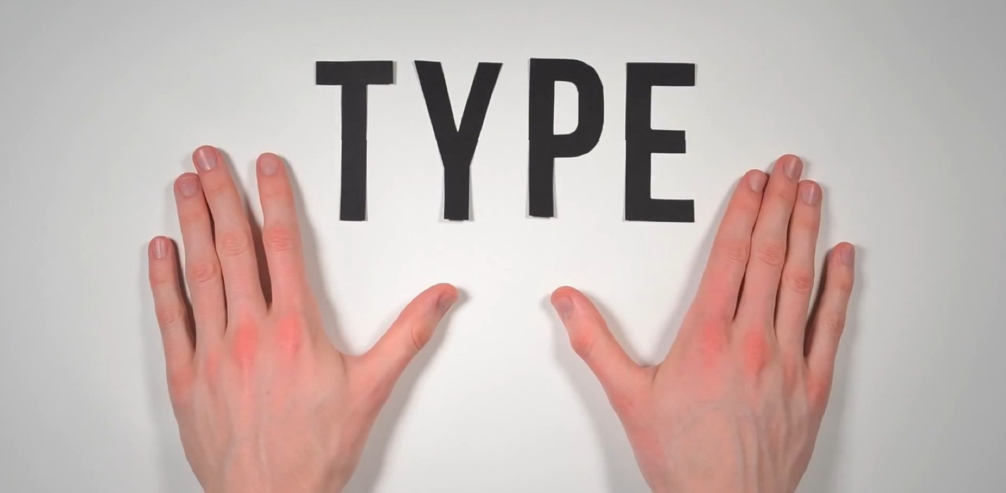
Design a typeface
Design a simple typeface by drawing letter shapes, testing readability, and creating a mini alphabet poster to explore shapes and spacing.


Step-by-step guide to design a simple typeface
HOW TO MAKE YOUR OWN FONTS | The Easy Way!
Step 1
Gather all Materials Needed and bring them to a clear workspace.
Step 2
Choose a mood for your typeface like bouncy playful tall slim or chunky bold.
Step 3
Use your ruler to draw three horizontal guide lines on sketch paper for the baseline x-height and cap height.
Step 4
Lightly sketch basic shapes for all 26 uppercase letters inside the guide lines with your pencil.
Step 5
Pick three short words and write each word once on the sketch page at a normal size to test readability.
Step 6
Write the same three words again at a smaller size to test how your letters look when tiny.
Step 7
Show the test words to a friend or family member and ask them to read each word aloud.
Step 8
Mark any letters that were hard to read with a small pencil circle.
Step 9
Redraw and improve only the marked letters so they look clearer and match your typeface style.
Step 10
Draw a neat grid on your poster board with your ruler that has one box per letter.
Step 11
Copy your final letter shapes into each grid box on the poster board using your black marker and then add a title with your typeface name using colouring materials.
Step 12
Share your finished mini alphabet poster on DIY.org.
Help!?
What can we use instead of a ruler, poster board, or a black marker if we don't have them?
Use a hardcover book or the long edge of a cereal box as a straightedge for drawing the three guide lines, replace poster board with sturdy cardboard or the back of a cereal box for the grid, and swap the black marker for a fine-tip permanent marker or black colored pencil when copying your final letters.
My letters look messy when I shrink them or the marker smudges on the poster board—what should I do?
If letters are unclear at the smaller test size or the marker bleeds, simplify the pencil sketches from the 'lightly sketch basic shapes' step, retrace the marked hard-to-read letters with a lighter hand using a fine-tip black marker, and let ink fully dry before circling boxes or adding color on the poster board grid.
How can I change the activity to make it easier for a 5-year-old or more challenging for a 12-year-old?
For a 5-year-old, widen the horizontal guide lines and poster board grid boxes and let them trace printable letter stencils during the 'sketch basic shapes' step, while a 12-year-old can add details like serifs, consistent stroke contrast, and spacing rules before copying the final shapes into the poster board grid.
What are simple ways to extend or personalize our mini alphabet poster after finishing the basic steps?
After adding your title with colouring materials, personalize the poster by creating matching lowercase letters, adding decorative ligatures or color-coded moods for each letter, or turning the alphabet into printable flashcards to share on DIY.org.
Watch videos on how to design a simple typeface
Typography Basics: Typeface Classification | FREE COURSE
4 Videos

Typography Basics: Typeface Classification | FREE COURSE
Font & Text Layout Ideas for Childrens Books (PART II) | Eevi Jones
5 Fonts Every Kid Should Know for Graphic Design
7 WAYS to START MAKING your own FONTS!
Facts about typography and lettering
🖨️ The Gutenberg Bible (1450s) used movable type whose letters were designed to look like handwriting — early typefaces copied calligraphy!
🎨 Type design is a mix of art and math: designers shape each letter so the whole alphabet looks like a family.
↔️ Tiny spacing changes called kerning and tracking can make words look squished or spacious — even small tweaks change readability.
🧩 The x-height (the height of a lowercase “x”) affects how big or small a font looks at the same point size.
📚 Serif fonts have little strokes at the ends of letters and are often used in books because serifs can help guide the eye across lines.
How do I design a simple typeface with my child?
What materials do we need to design a mini alphabet poster?
What ages is this typeface activity suitable for?
What are the benefits and fun variations of designing a typeface?
