Font Facts For Kids
A font is a specific size, weight, and style of a typeface that determines how letters, numbers, and symbols look on the page.


Do more with AI
Introduction
Have you ever noticed how some letters look different from others? 🤔These different letter styles are called "fonts"! Fonts make words look fun and interesting. They are used in books, on websites, and even on signs. Just like your favorite cartoon characters, fonts have special personalities! Some fonts are bold, some are curly, and some are super fancy! 🎉Learning about fonts can help you become a better reader and writer. In this article, we will explore the world of fonts, how they are made, and their history. Let’s jump in! 🚀
Images of Font

Metal type sorts arranged on a composing stick

A 1910 letterpress poster, advertising an auction, using a variety of typefaces and fonts

Weights of the typeface Neue Helvetica

Bold and regular versions of three common fonts. Helvetica has a monoline design and all strokes increase in weight in bold. Less monoline fonts like Optima and Utopia increase the weight of the thicker strokes more. In all three designs, the curve on 'n' thins as it joins the left-hand vertical.

Cyrillic italics and allowed variations

'Upright italic' within normal italics

The typeface Avenir Next in condensed and regular widths.

A set of optical sizes developed at URW of the typeface Leipziger Antiqua. The fonts become thicker and more widely spaced as the point size for which they are designed decreases.
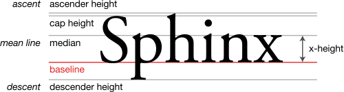
Font metrics
Cyrillic italics and allowed variations
Metal type sorts arranged on a composing stick
A 1910 letterpress poster, advertising an auction, using a variety of typefaces and fonts
Weights of the typeface Neue Helvetica
Bold and regular versions of three common fonts. Helvetica has a monoline design and all strokes increase in weight in bold. Less monoline fonts like Optima and Utopia increase the weight of the thicker strokes more. In all three designs, the curve on 'n' thins as it joins the left-hand vertical.
'Upright italic' within normal italics
The typeface Avenir Next in condensed and regular widths.
A set of optical sizes developed at URW of the typeface Leipziger Antiqua. The fonts become thicker and more widely spaced as the point size for which they are designed decreases.
Font metrics
Types Of Fonts
There are many types of fonts, each with its own style! 🤓Here are some popular types:
1. Serif: These fonts have small lines at the ends of the letters. Examples include "Times New Roman" and "Georgia."
2. Sans Serif: These fonts don’t have those little lines! "Arial" and "Helvetica" are famous sans serif fonts.
3. Script: These fonts look like beautiful handwriting! They can be swirly and elegant, like "Brush Script."
4. Display: These fonts are fun and unique, great for titles! Examples are "Impact" and "Curlz MT." Watch out—some fonts are best for signs, while others shine in party invites! 🎈
Styles Of Fonts
Fonts can have different styles to show different emotions! 🎭Here are a few:
1. Bold: Makes letters thicker and stands out! Perfect for titles!
2. Italic: Slants letters to the right, often used for book titles or emphasis!
3. Underlined: Draws a line under the letters to highlight something important!
4. All Caps: Makes all the letters uppercase, giving a shout-out feel! 🗣️ Just like shouting in writing! With these styles, you can play around with your words and make them exciting!
What Is A Font?
A font is a specific way of writing letters and numbers! 🎨It's like having a unique costume for each letter. A font has a certain size, weight (how thick or thin the letters are), and style (like bold or italic). For example, the font "Arial" looks clean and easy to read, while "Comic Sans" looks playful! Different fonts can change how we feel about the words we read. Imagine reading a spooky book in a Halloween font! 🎃Fonts help us express ourselves and make things visually fun!
The History Of Fonts
Fonts have an exciting history that goes back a long time—over 500 years! 📜The first movable type was invented by Johannes Gutenberg in Germany in the 1440s. This invention made printing books much easier and faster! Before that, books were written by hand! As time went by, designers like Claude Garamond created different typefaces in the 1500s. Today, we have thousands of fonts on our computers! 🌍Fonts have changed how we share stories and ideas, making the world a more colorful and fun place!
Font Weight Explained
The weight of a font describes how thick or thin the letters appear. 🏋️♂️ Fonts can be light, regular, bold, or even extra bold! For example, "Arial Bold" makes your letters stand out and look strong! 💪Bold fonts are perfect for important words like “STOP” on signs. It tells you to pay attention! Lightweight fonts, like "Arial Light," are more delicate and can make a friendly, soft look. Choosing the right font weight helps your words carry the right feelings—like excitement or calmness!
Fun Facts About Fonts
Did you know some fun things about fonts? 🎉Here are a few cool facts:
- The font “Comic Sans” was made in 1994 for a comic book!
- There are over 800 different fonts available in Microsoft Word!
- The longest typeface name is "Squeezebox"—isn't that silly?
- Fonts can boost your mood! Bright and playful fonts can make you smile! 🥳So next time you read, think about the style of each letter. You might discover a whole new world of letter fun!
Choosing The Right Font
Picking the right font is like choosing the right outfit for a party! 🎊First, think about what you want to say. If it’s a birthday invitation, you might want a fun font like "Jokerman"! For school projects, a clear font like "Arial" is great. ✏️ Next, consider your audience. Younger kids might like colorful and playful fonts, while grown-ups prefer simple and easy-to-read fonts. Finally, remember to keep it balanced. Too many font styles in one piece can look messy. Finding just the right font makes your writing shine! 🌟
Font Size And Its Importance
Font size is about how big or small the letters are! 📏It’s important because large fonts grab attention, while tiny fonts might be hard to read. For example, headlines often use large fonts to catch your eye, while body text uses smaller fonts for comfortable reading. Choosing the right font size can make a huge difference in how easily someone can understand what you wrote! Did you know that a standard size for reading is usually around 12 points? It's like magic for friendly reading! ✨
Fonts In Digital Vs. Print Media
Fonts look different in digital (online) and print (on paper) media! 💻📄 In print, fonts are carefully chosen to ensure they are easy to read on paper. Common print fonts include "Times New Roman" and "Georgia." On the internet, fonts also need to be readable, but we have more fun options! For example, "Verdana" is perfect for screens! Digital fonts can be animated and colorful, adding extra flair to websites. Remember, choosing the right font can affect how friends enjoy your messages, whether online or on paper! 📬
Common Misconceptions About Fonts
Many people think that all fonts are the same, but that's far from the truth! ❌Each font has its own unique look and personality. Some folks believe that fancy fonts are always better, but sometimes, simple fonts are the best choice for clear reading! Also, some think italic fonts are just for emphasis, but they can also show quotes or titles! So next time you see letters, remember there's more to them than meets the eye! Explore the world of fonts, and you’ll discover endless possibilities! 🌈
Font Quiz
Learn more about Font
