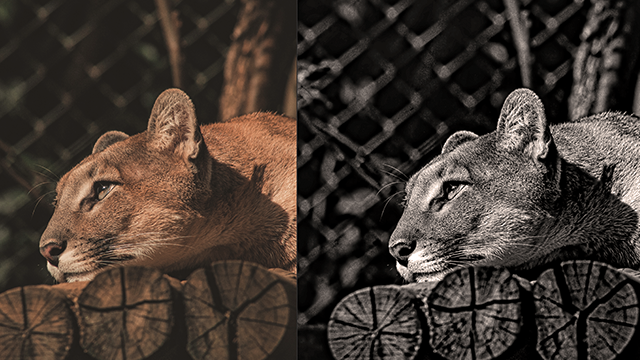
De-saturate your creations
Make grayscale versions of your drawings or photos by removing color, mixing black and white paints, and studying value, contrast, and mood.

Step-by-step guide to de-saturate your creations
Step 1
Gather all the materials listed and set them on a clean table so everything is easy to reach.
Step 2
Pick one drawing or photo that you want to turn into a grayscale version.
Step 3
Look closely at your picture and point out the lightest area and the darkest area.
Step 4
Squeeze a little white paint and a little black paint onto your palette or plate.
Step 5
Mix five gray tones on the palette from mostly white to mostly black to make a value scale.
Step 6
Paint a small patch of each gray tone on scrap paper and label them 1 through 5 from lightest to darkest.
Step 7
Lightly sketch the main shapes of your picture onto the plain paper with your pencil.
Step 8
Look at your sketch and mark each area with the number from your value scale that matches how light or dark it should be.
Step 9
Paint the lightest areas first using the lightest gray tone you mixed.
Step 10
Paint the midtone areas next using the middle gray tones you mixed.
Step 11
Paint the darkest areas last using your darkest gray and add small details for contrast.
Step 12
Step back and compare your grayscale painting to the original and decide if any parts need to be lighter or darker.
Step 13
Adjust any areas by adding a little more white or black paint to the matching gray tone to fix value and contrast.
Step 14
Let your painting dry and then share your finished grayscale creation on DIY.org
Help!?
What can we use if we don't have white or black paint or a proper palette?
If you don't have white or black paint, use a paper plate as a palette and make five gray tones by diluting a dark acrylic or tempera to create lighter washes or, alternatively, create a five-value scale with graphite pencils on scrap paper instead of painted swatches.
My gray mixes look muddy or too similar — what should I check or do?
If your gray mixes look muddy or too similar, clean your brush between mixes, add only a little white or black at a time while testing each tone on scrap paper as in step 5, and compare them to the lightest and darkest areas you identified in the original (step 3) before painting.
How can I adapt this activity for different ages or skill levels?
For younger kids (4–6), have an adult pre-mix three gray tones and let them label 1–3 and paint with chunky brushes after a simple traced sketch (step 6), while older kids (10+) should mix all five tones themselves (step 4), use finer brushes for details (step 9), and aim to match subtle midtones.
How can we extend or personalize the grayscale painting after it's dry?
To extend the project, make a series of grayscale studies with different value contrasts, add one selective accent color for dramatic contrast before you adjust values in step 11, or mount and photograph the dried piece to share on DIY.org.
Watch videos on how to de-saturate your creations
Digital Art ESSENTIALS For Beginners! (tutorial)
4 Videos

Digital Art ESSENTIALS For Beginners! (tutorial)
Learning Color Temperature Will Change How You Paint

START HERE with Digital Art | Step by step Tutorial

How to Start learning DIGITAL ART
Facts about grayscale and value in art
🎨 Grayscale art removes hue so you can practice 'value'—how light or dark each part of your drawing is.
🖼️ Artists use a value scale (often 9 or 10 steps) to match lights and darks when translating color into gray.
🧪 Mixing black and white changes value, and different whites (titanium vs. zinc) can change opacity and temperature.
📷 Many famous photos and films are black-and-white because removing color highlights texture, contrast, and mood.
🎭 Chiaroscuro is a dramatic light-and-dark technique used by painters like Caravaggio to make scenes pop—great inspiration for grayscale work.
How do I make a grayscale version of my drawing or photo?
What materials do I need to de-saturate drawings or photos?
What ages is this activity suitable for?
What are the benefits of making grayscale versions of artwork?
